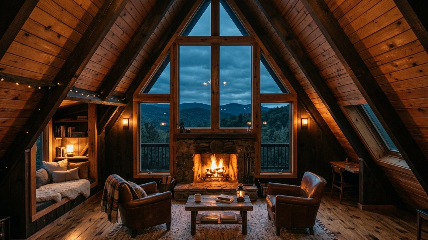
An A-frame's sloping walls are either the most annoying thing about it or the best. Pitched at around 45 degrees, those walls decide where every piece of furniture can go. And which one comes down entirely to how you style them. Fight the angles, and you've got wasted space and furniture that won't fit. Work with them, and you get cozy nooks and a soaring, dramatic centre that no boxy house can touch. Here's how I style an A-frame so the awkward angles become the whole appeal.
Stop Fighting the Slopes
The core mistake is treating an A-frame's sloped walls like vertical ones, trying to put tall furniture or anything that needs headroom against them, then being frustrated. The angles aren't going anywhere, so the whole game is assigning them jobs they're actually good at. Once I stopped fighting the slopes and started using them on their own terms, A-frames went from a styling headache to my favourite shape to work with.
Low Stuff Under the Low Walls
The space under the slopes, where headroom is tight, is perfect for everything that doesn't need height, built-in storage, low seating, a bed, a desk, low shelving. Tucking low-clearance functions into the low edges turns the most 'awkward' space into the most useful, and creates cozy, sheltered nooks in the bargain. The low walls aren't dead space; they're the coziest, most efficient space in the whole A-frame once you use them right.
Save the Gable for Drama
The tall gable end, usually the wall with the big window, is the A-frame's signature. So I keep it relatively clean and let the glazing, the view, and the sheer height be the drama. Cluttering the gable wall wastes the one feature that makes an A-frame special. Styled simply, it becomes the showpiece the whole interior orients around. Restraint on the gable is what lets it do its spectacular job.
Use the Height as Volume, Not Storage
The soaring centre is about feeling and light, not square footage to fill. I let the full-height middle be open and breathing, circulation, drama, the woodsy volume an A-frame does better than anything. Trying to cram a mezzanine of stuff into the peak usually kills the magic. The height is an experience to leave open, while the useful storage happens down low under the slopes. Let the volume be volume.
Lighting the Tall Space
A-frame lighting trips people up: they light only from way up in the peak and leave the living level dim. I do the opposite, warm low light where life happens (floor lamps, sconces, lamps) so the space feels cozy, plus considered pendants hung down at a usable height or fixtures that wash the gable for drama. Light the living down low; treat the height as atmosphere, not the main light source. That's the A-frame lighting secret.
Balance Drama With Cozy
The best A-frames offer both wow and warmth, a dramatic soaring centre and snug, human-scale nooks to actually settle into. So I deliberately create cozy low zones with warm light and rich texture under the slopes to balance the grand height. All drama and no intimacy feels like a lobby; all cozy and no height wastes the shape. The magic of an A-frame is having both at once, and styling for both on purpose.
Furniture That Fits the Shape
I choose furniture that suits an A-frame's geometry, lower pieces that slide under the slopes, the right scale for the soaring centre, nothing too tall fighting the angles where they close in. Picking pieces for the actual shape of the room, rather than forcing standard furniture into a non-standard space, is half the battle. Work with the geometry and the furniture looks intentional; fight it and everything looks crammed.
Make the Angles the Point
Styled well, an A-frame's angles stop being a compromise and become the entire appeal, cozy sheltered nooks under the slopes, a dramatic gable, a soaring warm centre, all lit to feel both dramatic and intimate. The shape that scares people off is the shape that, handled right, gives you a more interesting and more cozy interior than any rectangle could. Lean into the angles and the A-frame rewards you.
Gear & lighting in this post: hanging lights for the bedroom and floor lamps for the living room